Thursday 29 December 2011

Production - Progress of Digipak's Inside Panels

Step-by-step animation showing the progress of my digipak's inside panels
...
In order to achieve the above outcome, I knew right away that the photo I planned to use across both inside panels had to be edited. First of all, I added a black and white filter on the photo, before putting an additional reddish-orange colour overlay (in Photoshop CS3: Layer > Layer Style > Blending Options > Color Overlay > Blend Mode: Overlay), creating a nice contrasting effect. Because the shadows were now emphasized, I was able to easily edit out the tripod leg on the right using the Brush Tool. I subsequently also noticed that there was another out-of-place object, this time on the floor to the left. After a few unsuccessful attempts at using the Brush Tool again to edit it out, I experimented with the Clone Stamp Tool instead which allowed me to 'sample' a patch of the carpet texture (alt + left click). Then, using the stamp I covered up the object which in turn replicated the texture. I made sure to blend it in as much as possible, resulting in a pretty convincing edit! I then added yet another colour overlay over the whole image, this time opting for the Blend Mode: Hue setting, which lightened the colour slightly. I also used the Inner Glow effect under the Blending Options menu in order to add a faded black border as a finishing touch.

Adding layer effects in Photoshop CS3
...
Afterwards, I started exploring online Photoshop tutorials in the hopes of stumbling across something that could enhance my design. In the end, I found this glowing text tutorial, which I loosely followed in order to create the 'Lights Out' typography you can see in the final steps above. Whilst creating it, I hoped to give a "light graffiti" effect, as seen in Imogen Heap's album booklet (and featured in this slideshow). At the moment, however, I am undecided whether I will keep it, as I'm not sure if it fits in with the overall design, but it's definitely something I will consider.

Original glowing text effect experimentation

Tuesday 27 December 2011

Research - Album Stickers

A common feature for albums, which I have decided to replicate for my digipak, is the presence of a promotional sticker that is affixed to the front cover. The sticker serves as an additional way to entice the consumer into purchasing the album, by highlighting the inclusion of singles that the audience may be familiar with, special edition features, etc. I have therefore decided to take a look at various examples of these stickers, which you can see for yourself below, and identify the information that is most commonly displayed on them.

Hover over to expand:

  • Singles that are included (e.g. "Includes the #1 single...")
  • Bonus content - extra tracks, bonus disc, making of's, etc.
  • Excerpts from favourable reviews (e.g. "The voice of 2011 - Q Magazine") and/or amount of 'stars'.
  • If the album is a limited or special edition version, then it is clearly labeled as such.
  • Album and/or artist name may be repeated for emphasis
  • Barcode number (in small characters - also present on the album's spine)

Saturday 17 December 2011

Planning - Ancillary Product Ideas

Production of Ancillary Product

I spent some time on Photoshop on Friday slightly putting the start of my Digipak together. Below is the original cover I started with, however I didn't like the shade of the images so I edited them and tried again.


Here I have added the 'I Still Know' font, just to see how it looks. I also added the title of the album beneath, with a font I found on Da Font. I am still unsure about the fonts but am trying them out regardless. However I like the effect of the pictures this time and think it makes the album cover stand out.


Planning of Ancillary Work - Fonts

Here is a list of some of the fonts I have been browsing. I used a website called 'Da Font' whereby I am able to download fonts and import them into photoshop. There is also a programme on Photoshop that lets you choose from a variety of fonts the programme. Below are the ones that have caught my attention. I particularly like the top font 'I Still Know' found on the Photoshop font programme, as well as the final font 'Decibel' which I found on Da Font.
I think I am most likely going to go with 'Decibel' for my final Digipak cover, however I have tried out the other fonts on my template just to see how they look. I think the font is still clear to read, and I like the shakey effect it has on it. I also like the fact that it is Sans Serif, I think this style of font represents the artist more as it represents her different, alternative style of music.


Planning Ancillary Work - Editing Images

 The image to the left is the edited version of the original image (right) that I will be using for my front cover. I will zoom in closer to this image because I think the facial expression will appeal straight to the audience, and the close up will work better on the front cover. This style of make up and costume resemble the video and automatically links them. It also represents the alternative 'artistic' feel to the artist.


I also edited this image using iPhoto to create a different effect. I felt the other one was two yellowy and rich in colour, so I sharpened the image so more detail in the background is obvious. I also changed the colour tone, but using the fade tool. This makes the image look duller in colour, as I think it works a lot better in representing my artist,


Friday 16 December 2011

Planning - Do's and Don'ts

Before beginning work on our ancillary products, we went over some advice in class of what to do and not do when producing these pieces of work. This was handily given to us in the form of a handout and our teacher demonstrated these suggestions in Photoshop for us.

First of all, and one of the most important things to consider, is the font choices. We must make sure that they are clear and easy to read, as the consumer must be able to easily recognise the artist and album names, often from a distance. In addition, these must be of an appropriate size, which also applies for the images used. To help us to identify these conventions, we've been looking at existing albums. From this, we have observed that the artist name is commonly larger than that of the album name, and so I'll be adapting this for my own album. The font should additionally be appropriate in fitting with the overall house style (i.e. it should be consistent from panel to panel) and the artist's genre conventions, and should be carefully placed accordingly.

Photos used must be in focus and if they are the wrong size then the dimensions shouldn't be disproportionally stretched or constrained to fit the template. This is because this is never done in real examples and it ultimately gives off a really amateurish look. Colours should be chosen carefully. Usually, albums use no more than about three main colours which are appropriate for the text, images and background. The colours used should also ideally complement each other and be easy on the eye. Effects such as filters, whether on text or image, should be used scarcely, and only if suitable for the genre.

Keeping all of this in mind, I created the following example of how not to create an album cover...

Tuesday 13 December 2011

Production - Beginning to Produce Digipak

Now that I have produced a mock-up, of which my teacher approves of, I have begun working on the actual product. I have been using both Photoshop Elements and Photoshop CS3, as I have the latter at home (which I'm much more accustomed to using). Below you can see a video I filmed showing my progress over the weekend.


Following this, we had our last lesson before the Christmas break today. Because of this, it is crucial that I continue working on my ancillary products over the next couple of weeks, especially since we will be missing a couple of lessons. Nonetheless, below you can see what I have worked on today and how the front and back of my slipcase look like.

Digipak Mock Up


Practicing Photoshop

We were given a tutorial on how to use Photoshop followed by some images of a template so we could have a try of making our own digipaks. In this lesson I got to grips with tools such as Magic Wand Tool, changing the layers, adding effects to images and how to inverse images. I was also able to practice changing colours and rotating and sizing text effectively.
Here are two images of the work I made in that lesson.

Teacher Feedback

Nick - your blog is amazing!  Awarding-winning brilliant.  Your mock-up is so detailed that it could pass for the final piece.

The rest of you... bit of a lack of work around the ancillary products at the moment (hint hint).  Your blog on the whole is great - keep up this good work.

Monday 12 December 2011

Planning - Researching Fonts

Below are several different fonts that I've gathered with the help of website DaFont. I have decided that I want a very legible sans serif font for the artist's name. For the album name, I want a slightly more expressive font, and so I think a script font will work well.

Sunday 11 December 2011

Planning - Digipak + Advertisement Mock-up

Digipak outer panels

 
Digipak inner panels

Slipcase panels

Advertisement

Planning - Shortlist of Photos

After going through the photos that we took during the music video shoot (see post here), I began to narrow them down to the final few that I want to use for my ancillary products. But first, I decided for my digipak to have four panels, with an additional outer slip case. I came to this decision after taking inspiration from Bat For Lashes' digipak for the special edition of 'Two Suns'. What I liked about this example is that it essentially allows the album to have two covers - one on the digipak and one on the slipcase. This means that the fan gets something extra by buying the digipak, as well as alternate artwork.

Bat For Lashes - Two Suns (Special Edition)

Taking this into consideration, I have decided to have the digipak feature photos of Poppy taken during the fairy lights scene from the video, whilst the slipcase depicts Poppy in her red dress. This is because I wanted the digipak's images to look consistent, whilst the slipcase features something different but still keeps with the dark aesthetics and ties in with the music video. The latter also applies for the rest of the photos, as I want to only feature photos taken on set in order to build Poppy's artist image and convey her in a consistent fashion. For my advertisement, I plan to feature the digipak cover image prominently, in addition to a thumbnail of the slipcase cover. This means that the consumer would be able to recognize Poppy on both the main digipak cover art, as well as the limited edition slipcase, if they were to encounter either on a shelf in a store.

So without further ado, below you can see my selection of photos.

Thursday 8 December 2011

digipak lesson tutorial

screen on the green

Research - Similar Album Covers + Titles

As we have begun planning what we want our digipaks and advertisements to look like, I started to think about what we could call Poppy Power's debut album. Often, first albums are self-titled, however this isn't always the case. Inspired by the featuring of fairy lights in our music video and the contrast between light and dark, I suggested the album title 'Lights Out', which my group seemed enthusiastic about. It's short, memorable, and I feel will represent the album well, so it looks like we'll be sticking with it!

Teaser image / experimenting with Photoshop

One issue that was brought up, however, is that choosing such an album title may be limiting. For example, we looked at the artwork for Ellie Goulding's similarly titled debut album - Lights - which features graphic design elements that surround and illuminate the artist and emphasize the album title. Therefore, we felt like we would have to settle on a theme that features lights for the digipak design. Whilst I think this would be interesting, I went on to look at another similar artist, Clare Maguire, - who's debut album is titled 'Light After Dark'. The artwork in this case, however, simply features a shot of the artist with little graphic design or obvious reference to the album name. Therefore, the album design doesn't always have to reflect the title, which gives us freedom in coming up with whatever design we feel would fit best.

Saturday 3 December 2011

Research - Analysis of Magazine Advertisements


I Blame Coco and Marina and The Diamonds both share a similar audience to Florence and the Machine. Below you can see three magazine adverts advertising these respective artists that I've analyzed, along with the artwork of their albums.

I Blame Coco
Marina and the Diamonds
Florence and the Machine

Production - Final Music Video

ANCILLARY RESEARCH: Analysis of 3 Magazine Advertisements


Note to Rebecca
I will get back to this blog next week as I am completely clueless about the genre of music we are doing and other artists within this genre. I will see my group and get a little help about the genre and relevant artists so that I can do this blog properly (as they know a lot more about this genre than I do). So please excuse me :)

I will get this blog done by early next week once my I have spoken to my group if that is ok with you. Thanks.

ANCILLARY RESEARCH: Analysis of 3 Digipaks

Note to Rebecca
I will get back to this blog next week as I am completely clueless about the genre of music we are doing and other artists within this genre. I will see my group and get a little help about the genre and relevant artists so that I can do this blog properly (as they know a lot more about this genre than I do). So please excuse me :)

I will get this blog done by early next week once my I have spoken to my group if that is ok with you. Thanks.

Researching Ancillary Products - HMV

Here is a Prezi I created after going into HMV and capturing some pictures of where the original singer of 'Howl' (Florence and the Machine) CD is placed and other merchandise on her that the shop sells. This shows the section that my Digipak will be placed and the type of extra products that can be produced to help promote my artists new album e.g : Calenders, Posters etc.

Researching Ancillary Products - Digipaks

Here is a Prezi of my analysis of three Digipaks and magazine advertisements that relate to my genre. I felt there artists produce similar type of music to my artist as well as the fashion and ideas they represent are similar.
.

ANCILLARY RESEARCH: Digipak and Magazine tips

Digipaks and magazine covers all have conventions in which they all follow to make it look professional and appealing to consumers. We were briefed in class what to do and what not to do when designing and creating our digipak and magazine covers. Below are tips of what we should do and should not do when creating our ancillary products. These are the same rules professional ancillary products stick to so they can follow the conventions of a great finished piece which fans and potential customers would enjoy.

DO:
  • Use a clear font
  • Use appropriate sizes for images and font
  • Use clear photos that are focused
  • Use photos that are an appropriate shape for the page
  • Use an appropriate layout
  • Use relevant conventions associated with your genre
  • Use appropriate industry logos and conventions, properly positioned

DON'T:
  • Stretch images
  • Use multiple and unrelated layer styles
  • Use unnecessary effects unrelated to the genre
  • Place text across the artists face
  • Change text colour to the same or similar colour as the background
  • Use unnecessary fonts
  • Have an unorganised and hard to read layout
  • Use hard to read fonts
  • Use more than 3 or 4 different colours


What should a digipak look like?
Below is an image showing what the front and back cover of a digipak should look like. Firstly, focusing on the front, you can see that this digipak follows the conventions every digipak has; the front cover has the artist's name and the CD's album name clearly in the top right hand corner against a background which makes the text stand out and easy to read. The front image is clear and not to hectic with multiple effects and filters. Promotional stickers are placed on the front to attract attention to potential customers and hopefully gain a sale. Although this front cover does not have an image of the artist, it does have an image and colour scheme which relates to the genre of the music. The back cover follows the same conventions as the front with the same image dragged across both panels. The colours are still the same (black and yellow) with the same font and font colour kept. The back cover has the album track list like any other digipak along with other various production logos and information (in small writing).
Here are further examples of digipak covers. You can see that each cover follows the conventions of having the artist's name and album cover clearly visible, along with an image of the artist or relevant images to the genre of the music.

What should the inside of a digipak look like?
The inside of every digipak looks the same or similar and has the same references as the front cover. The majority keep the same font, same colour scheme and even sometimes the same images. A digipak on the inside usually contains more information and bonuses than what you'll expect from a CD. This can vary from bonus never before seen images of the artist (e.g. when they were younger) and/or exclusive information. Visually, the inside of a digipak such as the layout, font and image types are continued from the front cover. Graphical designs may be added to enhance the look of the inside and make it more personal to the owner. The are also some acknowledgements and maybe even some information about each individual track on the album. The track list can be repeated so the owner doesn't have to flip back and forth to see the track list at the back of the digipak. There are sometimes also some details and references to the production of that particular album and maybe even a booklet showing this in more detail.

    ANCILLARY RESEARCH: Importance and Function of Digipaks

    In one of our lessons, we discussed the importance and functions of digipaks to the artist and the industry. We looked at what it brings to the artists, the customers who buy them and how they are helping to combat piracy.

    Digipaks are a varied form of a traditional CD in the sense that they have the same concept, but look entirely different at the same time. Being around for over a decade, digipaks have the same aspects of a CD case, but look different and contain much more material. CD cases only contain a front and back cover with images and a tracklist at the back (as well as the usual production info and barcode). Unlike digipaks, CD cases have no content inside what so ever. All that it contains inside is the CD itself. Digipaks are made to give something more back to their loyal fans by providing much more information about the artist, their music and the album itself within most digipaks. Because of this extra content and information, they are more expensive. This means that digipaks are able to bring in more profit compared to traditional CDs. Also, being made from cardboard means that digipaks feel more like an image from the artist to the consumer, making it feel more personal and valuable to the buyer. As it is made out of cardboard, it does not easily break as well when dropped for example. Digipaks offer more quality to the buyer hence its higher price tag. By including extras such as booklets, images and extra information, this adds added value to the digipak as it feels like the buyer is getting more than just a CD.
    A unique 5 panel digipak.

    As digipaks are covered in designs chosen by the artist to match his/her personality, genre of music and general thoughts, they are much more creatively designed. In the past all CD covers looked the same being in the same old plastic hard case with only a front and back cover to look at. Now digipaks offer much more with designs varying from 3 panels opening out like a book, to 5 panels opening out like a box.

    The fact that digipaks can be so varied in designs means that they can be broadened out into different mediums. Digipaks are said to be targeted at dedicated fans who passionately follow the artist and their music. That is why digipaks are seen as a source of advertising. Artists are able to advertise their up and coming concerts/tours they may be holding. This is a useful form of advertising because, as some fans are genuine enough to purchase an artist's digipak (and not illegally download music for free off the internet), they are the targeted people artists aim for who are likely to buy concert tickets. Digipaks are seen to be targeted at true music fans who are willing to pay money for content and help an artist produce more music, rather than illegally downloading their music off the internet, thus killing the music industry. This is why digipaks are seen as important to the artist and industry. It is one of their last methods in trying to make money from the music they produce.

    Unlike MP3 downloads, digipaks cannot be downloaded from the internet as it is a physical form of music and packaging. It is possible to download the images on one artist's digipak, but the process of putting it together would not be the same as purchasing the original. Digipak offers extra content that an illegal MP3 download cannot give. This can include artistic imagery, information about their music and physical extras such as detailed booklets. A digipak promotes the artist in ways an illegal download cannot, and also offers true originally and quality in every copy.

    The "R" is becoming increasingly common on Rihanna's latest albums. It is seen as a trademark by the artist so whenever someone sees that "R", they instantly recognise that it is a product from Rihanna. 
    Rihanna has been recently advertising herself as a brand by implementing her trademark "R" on every new album she releases. This is so that it is instantly known that it is an album from Rihanna. She is increasingly becoming like a brand as well as an artist. For instance, Rihanna's red hair look was copied by many around the world as she set a trend in our society. She has influenced people in ways through the artistic nature of her digipak cover for people to imitate her appearance. 

    Friday 2 December 2011

    Research - Practice Digipak

    In today's lesson, Rebecca gave us a tutorial on some of the basic tools we can use on Photoshop Elements. Following this, I created my own practice digipak.


    For this design, I was able to successfully cut around the artist's face, which meant I could then change the background to a solid colour. I then applied a suitable filter over the image, although I was careful not to choose something too over-the-top. You can see the result above, although I decided to make some revisions afterwards (below).

    Thursday 1 December 2011

    Research - Analysis of Digipaks

    Below I have scanned in the panels of three digipaks of artists that I feel relate to either our genre or audience, before printing them out and annotating them.

    Kate Nash

    Bat For Lashes

    Lissie

    I chose the first two digipaks - from Kate Nash and Bat For Lashes - because they are both by female British artists that have some form of alternative influence in their music, just like Florence and the Machine, and all three can be classified as 'indie pop'. Lissie, whilst having alternative influences, is much more of a folk-rock/country artist. However, I chose her digipak as I feel it's exterior is a great example that could influence my own design (although I'm not feeling the two blank panels on the inside). Lissie also shares somewhat of a similar audience to Florence, which I've deduced from Last.fm calculating that they have a 'medium similarity'. As I explained in a previous blog post, this is based on the site's users' listening preferences, and so this means that a substantial number of people who listen to Florence and the Machine also listen to Lissie.

    Class discussion of Digipacks importance in the music industry.

    Now that we have finished with our music videos, it is time to move onto the digipak's. Last lesson we were asked questions about the 'artwork'. 

    "Why is artwork popular?" 
    In my group, 31, we discussed how artwork is so popular:
    * It gives the music artist the opportunity to demonstrate their style. Allowing the music artist to change their 'look'. 
    * Gives the artist an opportunity to set a trend for their fans. 
    *Artwork can indicate to the listener/audience what genre the music is going to be. 
    * Its a good way of attracting new fans. 
    * Its an expression of artistic intent. 
    * Establishes who the artist is.
    * The artwork can also illustrate the music artists personality. 


    How important are the ancillary products to the artist
     and the industry, and in relation to the music video? 

    * It brings in more profit as it is more expensive than buying the normal album pack. 
    * The industry broadens out into different mediums. 
    * It's a big way of advertisement. How else do we hear of new artists and their up coming albums?
    Advertisement is the way their audience hears about things. Advertisement is the way that new music artists get 'known' and recognized. 
    * It helps to combat piracy as you cannot download a digipak. And so, when you purchase a digipak, you get something 'special'. And so, the industry hopes that people are less likely to illegally download music if they are offered the chance of buying a digipak. 


    Wednesday 30 November 2011

    Research - Examples of Print Advertisements

    Below I have scanned in a variety of different magazine advertisements that I've come across and put them into a presentation. By flicking through the controls, you can see these examples side by side with the album released by the artist that is being promoted. It is clear that there is always some form of recurring theme between the albums and adverts, with the latter always using the same fonts.


    Immediately, it is evident that all the examples use the same image used on the album artwork, and if not, the image keeps with the established theme. An important factor to also note is that all the examples use somewhat muted colours, with the KT Tunstall one being an obvious example of this, as the image used has been edited to give a faded black and white effect. This is because using overly bright, eye-catching colours will result in the opposite, undesired effect for the consumer, giving an unprofessional look and feel. In the examples, you can see that the Kings of Leon and Goldfrapp examples use the most bright and warm colours, but even these are a light kind of shade that isn't too hard on the eye, in order to establish an inviting and aesthetically pleasing design.

    Research - Importance and Function of Digipaks

    Yesterday we had our first lesson since finishing the music video production and have now moved on to looking at the ancillary products we will be producing - a digipak and magazine advertisement. However, for this lesson we primarily looked at digipaks (as this is what we will be creating first) discussing the roles they play in terms of the music industry today.

    The first thing we covered was what a digipak actually is, which I went over in this post as I'm quite familiar with them already (I own several). Nonetheless, they are available in either four, six or eight panels which fold in on themselves, usually to the size of a regular jewel case album. Because of this, they allow more information and graphics related to the artist to be included and so the digipak is marketed towards fans that want something extra with their music. Ultimately, it is a way for the music industry to add value to an album and sell it for a slightly more expensive price than your average album. It also helps combat music piracy because, whilst a fan could illegally download the tracks from the album, they wouldn't be able to get the physical extras that come with the digipak. Whilst I think it's an interesting approach, I don't really see this as an effective way to entice fans on a wide scale to turn to buying music, especially with the new generation of young music fans that have only ever obtained music illegally. Nonetheless, I do find myself drawn to digipaks more than regular jewel case CDs, especially when they contain bonus content such as extra tracks or a DVD, so it must be working on some kind of scale.

    Example of a print advert explicitly promoting a 'limited edition digipak' version of an album, which I found and scanned from a copy of Q Magazine. It also mentions all the singles that have been released from the album, which the audience may be familiar with, as well as bonus DVD features, the latter of which aims to get the consumer to invest in the digipak, as they probably won't be able to obtain these bonuses illegally.

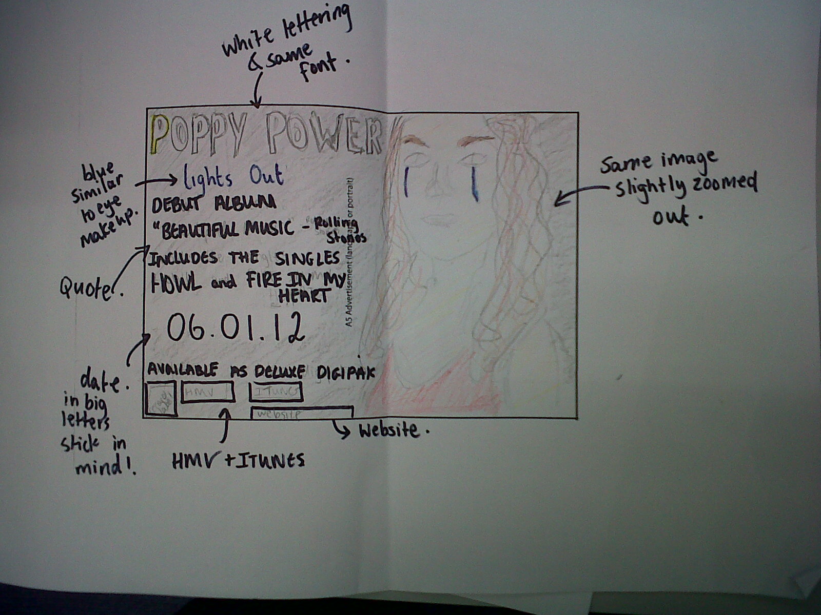
    Moving on, we looked at the features of a digipak which we will need to incorporate into our own designs, and their relation to the magazine advert. The main features that will definitely need to be included are the name of the artist, name of album, tracklist on the back + production information (e.g. copyright disclaimer, label, etc.) There are also a number of other things that could be included which are not typical of every digipak, but can be typical of a certain genre or target audience. This can include 'behind the scenes' photos (from a video shoot, live gig, etc.), thank you messages, lyric snippets and 'making of'' information. In addition, the colour scheme of and fonts used on the digipak must be thought about carefully, especially as these must tie in with the magazine advertisement. This is because there must be a recurring visual link between the ancillary products, which can be reinforced further by featuring similar or the same images from the digipak on the advertisement.

    But what is it about album/album covers, and more precisely digipaks, that makes them so popular? As a class, we raised several points regarding this. Artist image is a major one, as it helps consumers to be able to identify the artist that is portrayed on the artwork (unless they are of a genre where the artist is not usually shown, e.g. dance music). This in turn means that an artist could play with their persona, whether expressing a different one to who they are or to illustrate their personality. A good example that we discussed was Rihanna, who for each of her album eras has adapted a unique image and style. The release of her fifth studio album, Loud, cemented her status as a style icon with her signature red hair appearing on her album and single covers, as well as her music videos, and as a result being adopted by many. A simple Google search for "rihanna red hair" yields results such as "Get Rihanna's red hair" and "Does anyone know what shade of red Rihanna's hair is?", illustrating the influence she has had on pop culture with something as trivial as hair colour. Rihanna is just one of many artists who have made the most of their opportunity to demonstrate their style on their album artwork and in turn set a trend.

    Ancillary products as a whole are important for an artist and the music industry as without them, how else would the public hear about new music? By putting money into producing these products and advertisements, they are able to target a wide but also specific album purchasing audience. It also serves in trying to persuade more casual fans to part with their cash for a digipak by playing on their love of music, i.e. putting it across that if you are a serious fan of an artist's music then you should buy a copy of their digipak to add to your collection. All of this in turn leads back to the industry bringing in profit by branching out into a variety of media.