Saturday, 17 December 2011
Production of Ancillary Product
I spent some time on Photoshop on Friday slightly putting the start of my Digipak together. Below is the original cover I started with, however I didn't like the shade of the images so I edited them and tried again.

Here I have added the 'I Still Know' font, just to see how it looks. I also added the title of the album beneath, with a font I found on Da Font. I am still unsure about the fonts but am trying them out regardless. However I like the effect of the pictures this time and think it makes the album cover stand out.


Planning of Ancillary Work - Fonts
Here is a list of some of the fonts I have been browsing. I used a website called 'Da Font' whereby I am able to download fonts and import them into photoshop. There is also a programme on Photoshop that lets you choose from a variety of fonts the programme. Below are the ones that have caught my attention. I particularly like the top font 'I Still Know' found on the Photoshop font programme, as well as the final font 'Decibel' which I found on Da Font.
I think I am most likely going to go with 'Decibel' for my final Digipak cover, however I have tried out the other fonts on my template just to see how they look. I think the font is still clear to read, and I like the shakey effect it has on it. I also like the fact that it is Sans Serif, I think this style of font represents the artist more as it represents her different, alternative style of music.

Planning Ancillary Work - Editing Images

 The image to the left is the edited version of the original image (right) that I will be using for my front cover. I will zoom in closer to this image because I think the facial expression will appeal straight to the audience, and the close up will work better on the front cover. This style of make up and costume resemble the video and automatically links them. It also represents the alternative 'artistic' feel to the artist.
 I also edited this image using iPhoto to create a different effect. I felt the other one was two yellowy and rich in colour, so I sharpened the image so more detail in the background is obvious. I also changed the colour tone, but using the fade tool. This makes the image look duller in colour, as I think it works a lot better in representing my artist,
Friday, 16 December 2011
Planning - Do's and Don'ts

First of all, and one of the most important things to consider, is the font choices. We must make sure that they are clear and easy to read, as the consumer must be able to easily recognise the artist and album names, often from a distance. In addition, these must be of an appropriate size, which also applies for the images used. To help us to identify these conventions, we've been looking at existing albums. From this, we have observed that the artist name is commonly larger than that of the album name, and so I'll be adapting this for my own album. The font should additionally be appropriate in fitting with the overall house style (i.e. it should be consistent from panel to panel) and the artist's genre conventions, and should be carefully placed accordingly.
Photos used must be in focus and if they are the wrong size then the dimensions shouldn't be disproportionally stretched or constrained to fit the template. This is because this is never done in real examples and it ultimately gives off a really amateurish look. Colours should be chosen carefully. Usually, albums use no more than about three main colours which are appropriate for the text, images and background. The colours used should also ideally complement each other and be easy on the eye. Effects such as filters, whether on text or image, should be used scarcely, and only if suitable for the genre.
Keeping all of this in mind, I created the following example of how not to create an album cover...

Tuesday, 13 December 2011
Production - Beginning to Produce Digipak
Now that I have produced a mock-up, of which my teacher approves of, I have begun working on the actual product. I have been using both Photoshop Elements and Photoshop CS3, as I have the latter at home (which I'm much more accustomed to using). Below you can see a video I filmed showing my progress over the weekend.
Following this, we had our last lesson before the Christmas break today. Because of this, it is crucial that I continue working on my ancillary products over the next couple of weeks, especially since we will be missing a couple of lessons. Nonetheless, below you can see what I have worked on today and how the front and back of my slipcase look like.

Following this, we had our last lesson before the Christmas break today. Because of this, it is crucial that I continue working on my ancillary products over the next couple of weeks, especially since we will be missing a couple of lessons. Nonetheless, below you can see what I have worked on today and how the front and back of my slipcase look like.


Practicing Photoshop
We were given a tutorial on how to use Photoshop followed by some images of a template so we could have a try of making our own digipaks. In this lesson I got to grips with tools such as Magic Wand Tool, changing the layers, adding effects to images and how to inverse images. I was also able to practice changing colours and rotating and sizing text effectively.
Here are two images of the work I made in that lesson.


Teacher Feedback
Nick - your blog is amazing! Awarding-winning brilliant. Your mock-up is so detailed that it could pass for the final piece.
The rest of you... bit of a lack of work around the ancillary products at the moment (hint hint). Your blog on the whole is great - keep up this good work.
The rest of you... bit of a lack of work around the ancillary products at the moment (hint hint). Your blog on the whole is great - keep up this good work.
Monday, 12 December 2011
Planning - Researching Fonts
Below are several different fonts that I've gathered with the help of website DaFont. I have decided that I want a very legible sans serif font for the artist's name. For the album name, I want a slightly more expressive font, and so I think a script font will work well.


Sunday, 11 December 2011
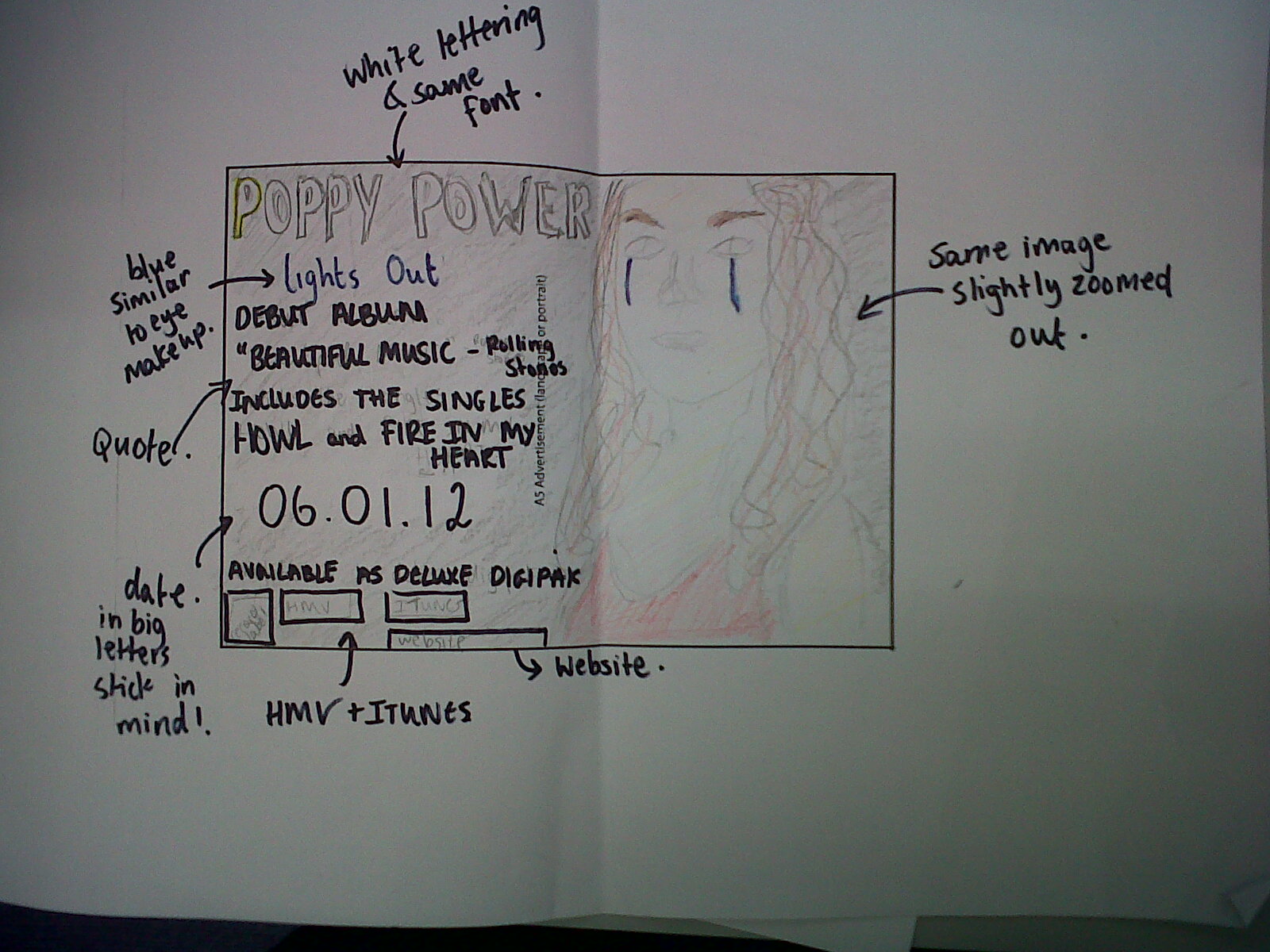
Planning - Digipak + Advertisement Mock-up
 |
| Digipak outer panels |
 | |
| Digipak inner panels |
 |
| Slipcase panels |
 |
| Advertisement |
Planning - Shortlist of Photos
After going through the photos that we took during the music video shoot (see post here), I began to narrow them down to the final few that I want to use for my ancillary products. But first, I decided for my digipak to have four panels, with an additional outer slip case. I came to this decision after taking inspiration from Bat For Lashes' digipak for the special edition of 'Two Suns'. What I liked about this example is that it essentially allows the album to have two covers - one on the digipak and one on the slipcase. This means that the fan gets something extra by buying the digipak, as well as alternate artwork.
Taking this into consideration, I have decided to have the digipak feature photos of Poppy taken during the fairy lights scene from the video, whilst the slipcase depicts Poppy in her red dress. This is because I wanted the digipak's images to look consistent, whilst the slipcase features something different but still keeps with the dark aesthetics and ties in with the music video. The latter also applies for the rest of the photos, as I want to only feature photos taken on set in order to build Poppy's artist image and convey her in a consistent fashion. For my advertisement, I plan to feature the digipak cover image prominently, in addition to a thumbnail of the slipcase cover. This means that the consumer would be able to recognize Poppy on both the main digipak cover art, as well as the limited edition slipcase, if they were to encounter either on a shelf in a store.
So without further ado, below you can see my selection of photos.
 |
| Bat For Lashes - Two Suns (Special Edition) |
Taking this into consideration, I have decided to have the digipak feature photos of Poppy taken during the fairy lights scene from the video, whilst the slipcase depicts Poppy in her red dress. This is because I wanted the digipak's images to look consistent, whilst the slipcase features something different but still keeps with the dark aesthetics and ties in with the music video. The latter also applies for the rest of the photos, as I want to only feature photos taken on set in order to build Poppy's artist image and convey her in a consistent fashion. For my advertisement, I plan to feature the digipak cover image prominently, in addition to a thumbnail of the slipcase cover. This means that the consumer would be able to recognize Poppy on both the main digipak cover art, as well as the limited edition slipcase, if they were to encounter either on a shelf in a store.
So without further ado, below you can see my selection of photos.
Subscribe to:
Comments (Atom)