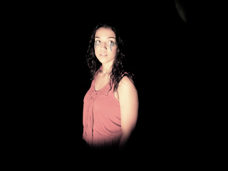
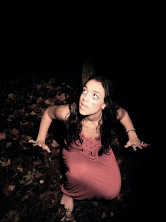
 The image to the left is the edited version of the original image (right) that I will be using for my front cover. I will zoom in closer to this image because I think the facial expression will appeal straight to the audience, and the close up will work better on the front cover. This style of make up and costume resemble the video and automatically links them. It also represents the alternative 'artistic' feel to the artist.
 I also edited this image using iPhoto to create a different effect. I felt the other one was two yellowy and rich in colour, so I sharpened the image so more detail in the background is obvious. I also changed the colour tone, but using the fade tool. This makes the image look duller in colour, as I think it works a lot better in representing my artist,
No comments:
Post a Comment