Wednesday 16 May 2012
Monday 30 January 2012
A note from Nick...
Hello! Thank you for going through my blog - I hope it was relatively interesting and that the effort I put into it shows through, but alas! It has finally come to an end. I've really enjoyed being a part of this project and I'm so grateful for my group, who have been amazing throughout this process. Also thanks to the teachers and technicians that have had to put up with us!
I leave you with the above video, which is the first official take that we filmed in Queen's Wood and has provided us with many laughs since! (We would have made a blooper reel but, you know, time got the best of us.)
I leave you with the above video, which is the first official take that we filmed in Queen's Wood and has provided us with many laughs since! (We would have made a blooper reel but, you know, time got the best of us.)
Saturday 28 January 2012
EVALUATION: Question 4
What have you learned from your audience feedback?

Having finished creating our music video, on Tuesday 6th of December 2011, our college had booked the Screen on the Green cinema in Angel so we can all see each others finished music videos. This gave us the opportunity to view each others music videos and compare the similarities and differences between them. As it was the first time our music video was being shown to everyone, it gave us the chance to see the audience's first reactions to our music video. Below is a video showing the audience's reactions when the music video starts and when it ends. The video below also contains some detailed and in-depth feedback from our college's head of media department, Mary (interview courtesy of Nick).
Mary had given some very detailed and feedback about our music video. Being a media teacher, Mary is very experienced within the media world and knows exactly what works and what doesn't. Thankfully, we received a rave review from a knowledgeable person who has seen may examples of student's music videos. Unlike most people I've heard reviews from, Mary firstly, she went on to praise Poppy's performance in the music video. By playing a big role brilliantly, Poppy was able to make the video look as if she was actually singing the song. She then went on to praise the camera work stating that how there was a massive range of shots. Overall, we had recorded nearly 20 base tracks from all different camera angles to make sure we had a variety of shots in the video. These ranged from low angle shots to extreme close ups. It was great for someone to have noticed this. She also mentioned how the lighting was consistent throughout the video where we tried to have as much lighting on Poppy as we could. She greatly appreciated the locations we recorded in and the images we projected on to Poppy using the projector. The shots and lighting were so unique that Mary even went on to say how it reminded her of Angela Carter. Picture below:
The mise en scene was something else she had said worked well by the way the costumes changed to suit the lighting and colours. This was because during the planning stages, we had discussed greatly the colours and outfits were to be worn by Poppy. We also spent time discussing what make-up she should be wearing and how it should be done.
Although I do not have much footage of peoples thoughts of my music video, I have heard extremely good reviews from everyone who has seen the music video. Many people have stated that they find my group's music video unique in terms of lighting and mise en scene and greatly appreciate the camera work and projection shots used as well as the make-up. As my group all contributed to create the music video, we all feel great appreciation that our music video was seen by many as a success. Much time and effort as well as commitment had been implemented into creating the music video and that effort has shown through in the work we have produced.
Our music video had been posted on YouTube by Nick in response to another successful video to hopefully gain some feedback. And gladly, we did. With over 1900 views on the video, our video had accumulated a few comments from friends and also random people. Below is a screen shot showing the last 8 comments on the video, with mostly all of them being positive.
There was however one comment on the video which provided useful information into how we can prove the music video.
 Although I do not know who this person is, they gave some good and bad feedback. Whereas Mary and many others had stated they like the way the costume changes depending on the lighting and colours, this person states they prefer the costume to stay consist in the woodland shots. Like may other people I have shown this music video to, they also went on to say that although the projection shot is a good idea, they feel as if it was used too much and not enough footage in the woodlands was used. I have to completely agree with this feedback. This is because as we were going for a theme where the artist is in touch with nature, we did not show that much footage of Poppy actually in the woods. When we did, most of the shots were recorded at night and you could not there see the surrounding woodlands. If we had the opportunity to redo this music video, I will take that advice greatly on board. This is because even I had stated to my group during the production stage that the projection shots were shown too much in the video. If we were to have the opportunity again, I have learnt to focus on each shot equally and make sure more of the woodland shots were implemented into the final edit. By doing this, the music video will present a more constructed theme, rather than the music video looking like its switching between two themes. With this improvement in place, the the music video would appeal to a more specific type of audience who like the opposite of an urban and technological advanced location.
Trying to find people who found criticism within our work was extremely difficult. As I stated before, people generally liked the music video for what it is as it had surpassed their expectations. An example of this is the below image. Out of 26 votes, 25 people had liked our music video.
If I had only received reviews from YouTube, then I would have been sceptical as the people who watched the video would have only watched it as it would have appealed to them in the first place. Someone who has no taste in this genre of music would not click on the video to watch it therefore making the reviews on YouTube slightly bias. However, the fact that I have received great reviews from people who have no preference in this music at all (such as my friends who listen to more of rap/hip-hop) says itself that the video contained shots or references that relate to everyone's tastes. Although this may sound great, this may also mean that we may have done something wrong. This is because when planning our music video, we had a general theme with a specific target audience in mind which we wanted to target. The fact that we met everyone's preferences shows that we didn't stick to our target audience as much as we'd should have. This has shown me and made me learn that mise en scene plays a big part in music videos and also that our music video needs to have a stronger and more clearer meaning. This is so the target audience get exactly what they want, and not a mixture of a bit of everything.
In terms of feedback for my ancillary products, all I have received are positive reviews. All three ancillary products had taken me over 25 hours to produce excluding planning time. This was because I had scrapped my initial plans after I had discovered I could not do certain edits with the images available to me. Having posted my advertisement to Facebook, I had received all round great feedback.

 |
| The journalist (known for her feminist work) Mary had compared Poppy to, due to the woodland shots we had filmed. |
Although I do not have much footage of peoples thoughts of my music video, I have heard extremely good reviews from everyone who has seen the music video. Many people have stated that they find my group's music video unique in terms of lighting and mise en scene and greatly appreciate the camera work and projection shots used as well as the make-up. As my group all contributed to create the music video, we all feel great appreciation that our music video was seen by many as a success. Much time and effort as well as commitment had been implemented into creating the music video and that effort has shown through in the work we have produced.
Our music video had been posted on YouTube by Nick in response to another successful video to hopefully gain some feedback. And gladly, we did. With over 1900 views on the video, our video had accumulated a few comments from friends and also random people. Below is a screen shot showing the last 8 comments on the video, with mostly all of them being positive.
 |
| Comments from our music video on YouTube. |

Trying to find people who found criticism within our work was extremely difficult. As I stated before, people generally liked the music video for what it is as it had surpassed their expectations. An example of this is the below image. Out of 26 votes, 25 people had liked our music video.
 |
| 25 people out of 26 had liked our music video. That is nearly a ratio of 4 dislikes per 100 people. |
In terms of feedback for my ancillary products, all I have received are positive reviews. All three ancillary products had taken me over 25 hours to produce excluding planning time. This was because I had scrapped my initial plans after I had discovered I could not do certain edits with the images available to me. Having posted my advertisement to Facebook, I had received all round great feedback.

As you can see, the comments from Facebook show what people think of my work. Each person said something different yet still positive and this is what I have discovered about my work. However, I have heard one or two comments from people stating what they did not like about the work. Firstly, the main thing people stated about both my digipak and advert is the font. The majority of people who look at my ancillary products state the way they love how the images blend together in a unique design and love the colours used. After I press people into saying something negative about the digipak and ancillary product, they always say that the font choice could have been better. I had used Dafont.com to download the font I had used in my ancillary product. However, after a bit of thought, I have learnt and realised that the font could have been more suited to the genre. This was because the font I had used is simple, plain and ordinary with a few effects added to it. The font itself is not one which stands out and has noticeable features that would make it unique to my work. Therefore I have learned that font choice is absolutely vital within my designs.
Overall I have learned a few things in reference to some feedback I have received on my group's work (music video) and my own individual work (my ancillary products). I have learned that my in my music video, most people liked the projection shots while some thought the shots over powered the video. What I have acknowledged from this feedback is that if I was able to redo the music video again, the edit would have to be changed slightly. It would be changed to evenly show Poppy in the forest the same amount of times it shows Poppy in front of the projector. I also learned that in terms of my ancillary products, everyone generally liked the design, the colours and the lighting, but feel as if the font was a let down. This was because people felt that the font didn't link that well with the theme and images and looks as if it much thought had not gone into it, when it had. If these could be redone, I really feel as if the design itself is great, but the font is not; I will change the font to one more suitable to the theme so it can all link up together. Overall, I don't think much change is needed in terms of my music video and ancillary products.
Friday 27 January 2012
Q4: What have you learned from your audience feedback?
What have you learned from your audience feedback?
With our music video, we were very pleased with most of our feedback that we obtained as it was all positive. Everyone liked the use of base tracks as well as some noticed the techniques that we used such as the sped up effect of the projection shot as well as the slowed down shot on the swing. Everything was well reviewed and I couldn't find anyone who could give us a full on negative comment or review on it.
Here is a video that I have used earlier on in my blog but it shows all of the reviews that I got after the premiere at the Screen on the Green.
What I have learnt from my feedback is that hard work pays off. My group and I worked so well as a team as well as dedicated our spare time to complete our editing, we listened to one an other's opinions and took them in, taking in each others feedback and working from it and molding it into the best music video that we could do.
For example, when we were deciding the possible endings for our video we all had different preferences on what we thought would look best and so we recorded each one and then looked back at them all one by one, deciding which one would be suiting to the end of the video:
Video A
Video B
Video C
With this compromise, we get good feedback as well due to when we show other people outside of our group the alternative endings, we have many different opinions on what they thought would suit best for the endings. Some thought that video A would suit best as it has a simple ending whilst the lights go out having the projections turn off my face revealing a hauntingly stare into the camera. Some people thought that it would be a good ending as it has a haunting effect where as some thought that it may not be exciting enough after all of the build up for it to be a slightly "boring ending"With video B had a good response from the audience as it has a sort of magical effect to it and as you watch the fairy lights switch off and the artist shut her eyes, it really shows the audience that the video it ending and many of the audiences agreed with this. Finally, video C got the most negative feedback from it as people said that it lingered too much on two shots and that it should vary more on the many options that we had s well as it didn't have "good enough shots, there should be more cuts to make it look more exiting." Over all, we used the ending of Video B.
Personally, if I had to critique my own video I would have improved on the following, I would have taken the time out to watch fully all the way through all of the shots that we had and then had written down or memorized the good shots so it would have been easier to track down the good shots from the bad as while we were editing, we made our lives a little bit harder by not taking the time out to look through every shot that we had filmed. That way I believe that we could have found better shots to use in some of the base tracks. (Not that I think the base track clips we used aren't good- I just believe that I could have chosen a slightly better ones that may suited the moment of the song better.)
 |
| Inside caption. |
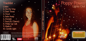
 |
| Front cover (right) Back cover (Left) |
 |
| Poster- Advertisement. |
Since most of the comments I got were positive, it is quite difficult to learn from what I can improve on since not many have said anything about what I should improve on except fro Nathan, however, what he said was then overpowered by everyone else mentioning on how much they "liked the font".
Over all, if I could have done more on my ancillary product, I would have wanted a more variety of useful images when editing as there weren't many images that we could have used as because of the lighting available, most of the images came out blurry.
Please go to link below- I tried to add it to the site like I usually do but it wouldn't upload. Sorry.
http://www.youtube.com/watch?v=qGWBbbGGwx8&list=UUjNjtfp78qkMeIKrvcFjJ3Q&index=1&feature=plcp
Evaluation - Question Four
What have you learned from your audience feedback?

On the 6th of December 2011 we visited the Screen on the Green cinema where every group's music video was screened. This was an invaluable experience, as we were able to see an audience's reaction to our music video, in addition to the possibility of receiving individual feedback, both of which I documented in the video below. As you can see from the comments that I filmed, we were given great feedback. This was also consistently true for all the other feedback we have received throughout the editing process from our peers and online via Facebook and YouTube.
Max was the first to comment in the video above, stating that he believes the editing is the strength of our video. This is great because we put a lot of effort into the editing, so the fact that that shows through is definitely a positive thing. This was one of the many things Evie mentioned too, in addition to praising our performer and her costumes. This was something we thought about extensively during the planning stage, as we knew how important an artist's styling is in order to appeal to an audience. By portraying Poppy in a modest yet slightly eccentric way, we broke the conventions of modern pop videos, making it clear that our artist is not marketed for strictly mainstream consumers, instead opting for a more niche, artistic, young adult audience, such as that of the audience profile we created early on (see here).
Judging from the audience's reaction and responses, I learned that the video met, or perhaps even exceeded, their expectations. The fact that we received little criticism, even when I pressed people for possible improvements, makes me confident that our music video would appeal to its audience. However, I was still determined to find out what my audience thought we could have improved on. This is where YouTube came in handy. Since uploading the video to YouTube a month ago, it has garnered just under 2,000 views (the majority of which being from Florence + the Machine fans) and the following comments:

I then decided to contact each user that commented, requesting that they respond with any possible improvements, no matter how big or small. Here is one of the responses I received:

Above you can see some more constructive criticism in response to my request. This person commented extensively on areas that they felt could be improved. However, I think these are very little things that, if we had time to take them on board by working on the music video more, would only have made it even better. I must say though that, taking all things into consideration, I believe Poppy's performance was brilliant. Besides, we're not actors, so we couldn't really help it if the acting wasn't perfect! Nevertheless, I can definitely see where they are coming from. For example, some of the shots are indeed slightly shaky, but not once did we think that this hindered the overall feel of the video. In fact, I was wary of having too many steady shots as it might make the music video feel static whereas music videos tend to be energetic and full of movement. The comment on Poppy taking on the role of a character and building their backstory was something that made me think too, as we didn't really look at it in this way. In retrospect, this could have been interesting to explore.

In addition, several people commented on the video in relation to the song's original artist, which means that we successfully created a video that would appeal to Florence's fan base. One such comment compared our video to those of Florence's for Dog Days Are Over and Shake It Out. These two examples were in the backs of our minds during our production, although we weren't consciously trying to bring in major influences from them. Nonetheless, this is still a very good thing, as whilst we aimed to market Poppy as her own artist, there are definitely similarities when it comes to the way they are presented as musicians.
In light of the positive comments we were given, I couldn't help noticing for myself aspects of our production that I would have liked to improve which no one had mentioned. These are probably again, very little things, but I feel like they would have considerably improved the video. For example, the videos that we projected which were not sourced externally (i.e. forest shots that I filmed myself) were quite pixelated since they were taken with a phone. If we had planned in advance that we would use our own footage from the woods, we would have known to take out the camcorder during our visit. I mentioned this to Max after asking him for further feedback, and he agreed, although he noted that it wasn't something majorly noticeable. However, he did mention another improvement, which is that the projection shots would have been more successful if we hadn't had used the whiteboard for the background, and instead to have had empty space (a la Imogen Heap's video for Lifeline). I wholeheartedly agree with this, and would have loved to have had access to a portable projector. Unfortunately, this wasn't the case, and so we had to "make do" with the classroom projector.
...
All in all, I am very happy with the outcome of my music video, and whilst some of the feedback we received made me think about some of the decisions we made, I am confident that we couldn't have pulled off a better job in relation to the time restraints we had.
On the left you can see an image I created using a brainstorm creation tool (bubbl.us) which compiles together several comments I received via Facebook in response to my ancillary work. Many positive things were said, but there were quite a few suggestions and things to think about too.
For example, Comment B has made me think about the purpose of the promotional sticker, as I just assumed that they were useful for all album buyers. However, if someone is familiar with the artist's work, or if they do not know of the artist at all, then the sticker is made redundant. Ultimately, the consumer must have some form of familiarity with the artist in question; for example, if someone was to see Poppy Power's music video for Howl, and then encountered her CD in a store (with the sticker stating that Howl is included), this might encourage them to look into more of her songs or even give the album a spin. All in all, I think it's better to have the sticker than to not have it, as it's invaluable in getting across the highlights of an album in a simple way, and can be used to reinforce the fact that a CD is 'special edition'.
There were also a few comments stating that the image used for the digipak cover and advert isn't clear - because the image is quite dark and slightly grainy. I can definitely see why this could be a problem, especially since, as said in Comment G, I am marketing a new artist. However, I think the promotional slipcase makes up for this, as this is what would be seen first in stores.
My inside panels were complimented, especially when it came to the typographical design, with Comment I recognizing the fact that it looks like light graffiti. I am very pleased with the reception of this, as I originally wasn't sure if I should include it. One suggestion I was given, however, is that the words could have been placed together. Originally, I planned to do this, but I decided against it as I felt it left the other panel looked "uneven". In addition, I learned that my products link very well - the simple fonts and repetition of artist imagery being mentioned often. Again, I am pleased with the overall result and glad that it was generally well received.
On the 6th of December 2011 we visited the Screen on the Green cinema where every group's music video was screened. This was an invaluable experience, as we were able to see an audience's reaction to our music video, in addition to the possibility of receiving individual feedback, both of which I documented in the video below. As you can see from the comments that I filmed, we were given great feedback. This was also consistently true for all the other feedback we have received throughout the editing process from our peers and online via Facebook and YouTube.
Max was the first to comment in the video above, stating that he believes the editing is the strength of our video. This is great because we put a lot of effort into the editing, so the fact that that shows through is definitely a positive thing. This was one of the many things Evie mentioned too, in addition to praising our performer and her costumes. This was something we thought about extensively during the planning stage, as we knew how important an artist's styling is in order to appeal to an audience. By portraying Poppy in a modest yet slightly eccentric way, we broke the conventions of modern pop videos, making it clear that our artist is not marketed for strictly mainstream consumers, instead opting for a more niche, artistic, young adult audience, such as that of the audience profile we created early on (see here).
Judging from the audience's reaction and responses, I learned that the video met, or perhaps even exceeded, their expectations. The fact that we received little criticism, even when I pressed people for possible improvements, makes me confident that our music video would appeal to its audience. However, I was still determined to find out what my audience thought we could have improved on. This is where YouTube came in handy. Since uploading the video to YouTube a month ago, it has garnered just under 2,000 views (the majority of which being from Florence + the Machine fans) and the following comments:
I then decided to contact each user that commented, requesting that they respond with any possible improvements, no matter how big or small. Here is one of the responses I received:
"I really like it but some things I would change are maybe the outfits and make them more of the style of that pinkish grey one she wore on the swing. and the makeup make it more like she lives in the forest and add some scratches and dirt spots, and use more of the forest and less of the green screen... but don't change the actual location because that is the perfect place for this song"This comment has definitely made me look at my music video in a new light, as some of the projection shots could look disjointed in comparison to all of the forest shots. However, as a group we really loved these shots, and I think there's a good balance between them and those filmed in the forest. Nonetheless, it makes me wonder what our video would have looked like if we had not used any of the projection shots. It would have been great if we had been able to make alternate edits of the video (if we had more time, that is). The suggestion of adding "makeup [that makes it look] like she lives in the forest [such as] scratches and dirt" is also interesting, and seems to lean towards a much more literal translation of the song, which we weren't aiming to achieve, instead opting for a more abstract and visually rich portrayal of the song.
Above you can see some more constructive criticism in response to my request. This person commented extensively on areas that they felt could be improved. However, I think these are very little things that, if we had time to take them on board by working on the music video more, would only have made it even better. I must say though that, taking all things into consideration, I believe Poppy's performance was brilliant. Besides, we're not actors, so we couldn't really help it if the acting wasn't perfect! Nevertheless, I can definitely see where they are coming from. For example, some of the shots are indeed slightly shaky, but not once did we think that this hindered the overall feel of the video. In fact, I was wary of having too many steady shots as it might make the music video feel static whereas music videos tend to be energetic and full of movement. The comment on Poppy taking on the role of a character and building their backstory was something that made me think too, as we didn't really look at it in this way. In retrospect, this could have been interesting to explore.
In addition, several people commented on the video in relation to the song's original artist, which means that we successfully created a video that would appeal to Florence's fan base. One such comment compared our video to those of Florence's for Dog Days Are Over and Shake It Out. These two examples were in the backs of our minds during our production, although we weren't consciously trying to bring in major influences from them. Nonetheless, this is still a very good thing, as whilst we aimed to market Poppy as her own artist, there are definitely similarities when it comes to the way they are presented as musicians.
In light of the positive comments we were given, I couldn't help noticing for myself aspects of our production that I would have liked to improve which no one had mentioned. These are probably again, very little things, but I feel like they would have considerably improved the video. For example, the videos that we projected which were not sourced externally (i.e. forest shots that I filmed myself) were quite pixelated since they were taken with a phone. If we had planned in advance that we would use our own footage from the woods, we would have known to take out the camcorder during our visit. I mentioned this to Max after asking him for further feedback, and he agreed, although he noted that it wasn't something majorly noticeable. However, he did mention another improvement, which is that the projection shots would have been more successful if we hadn't had used the whiteboard for the background, and instead to have had empty space (a la Imogen Heap's video for Lifeline). I wholeheartedly agree with this, and would have loved to have had access to a portable projector. Unfortunately, this wasn't the case, and so we had to "make do" with the classroom projector.
 |
| Use of black space in Lifeline |
...
All in all, I am very happy with the outcome of my music video, and whilst some of the feedback we received made me think about some of the decisions we made, I am confident that we couldn't have pulled off a better job in relation to the time restraints we had.
 |
| Click to expand |
For example, Comment B has made me think about the purpose of the promotional sticker, as I just assumed that they were useful for all album buyers. However, if someone is familiar with the artist's work, or if they do not know of the artist at all, then the sticker is made redundant. Ultimately, the consumer must have some form of familiarity with the artist in question; for example, if someone was to see Poppy Power's music video for Howl, and then encountered her CD in a store (with the sticker stating that Howl is included), this might encourage them to look into more of her songs or even give the album a spin. All in all, I think it's better to have the sticker than to not have it, as it's invaluable in getting across the highlights of an album in a simple way, and can be used to reinforce the fact that a CD is 'special edition'.
 |
| Photo used for digipak and advert |
My inside panels were complimented, especially when it came to the typographical design, with Comment I recognizing the fact that it looks like light graffiti. I am very pleased with the reception of this, as I originally wasn't sure if I should include it. One suggestion I was given, however, is that the words could have been placed together. Originally, I planned to do this, but I decided against it as I felt it left the other panel looked "uneven". In addition, I learned that my products link very well - the simple fonts and repetition of artist imagery being mentioned often. Again, I am pleased with the overall result and glad that it was generally well received.
Subscribe to:
Posts (Atom)