 |
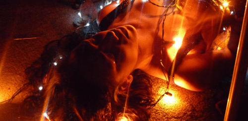
| Step-by-step animation showing the progress of my digipak's inside panels |
...
In order to achieve the above outcome, I knew right away that the photo I planned to use across both inside panels had to be edited. First of all, I added a black and white filter on the photo, before putting an additional reddish-orange colour overlay (in Photoshop CS3:
Layer >
Layer Style >
Blending Options >
Color Overlay >
Blend Mode: Overlay), creating a nice contrasting effect. Because the shadows were now emphasized, I was able to easily edit out the tripod leg on the right using the
Brush Tool. I subsequently also noticed that there was another out-of-place object, this time on the floor to the left. After a few unsuccessful attempts at using the
Brush Tool again to edit it out, I experimented with the
Clone Stamp Tool instead which allowed me to 'sample' a patch of the carpet texture (
alt + left click). Then, using the stamp I covered up the object which in turn replicated the texture. I made sure to blend it in as much as possible, resulting in a pretty convincing edit! I then added yet another colour overlay over the whole image, this time opting for the
Blend Mode: Hue setting, which lightened the colour slightly. I also used the
Inner Glow effect under the
Blending Options menu in order to add a faded black border as a finishing touch.
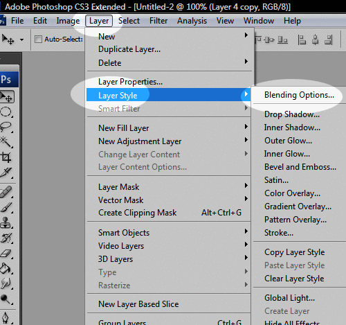 |
| Adding layer effects in Photoshop CS3 |
...
Afterwards, I started exploring online Photoshop tutorials in the hopes of stumbling across something that could enhance my design. In the end, I found
this glowing text tutorial, which I loosely followed in order to create the 'Lights Out' typography you can see in the final steps above. Whilst creating it, I hoped to give a "light graffiti" effect, as seen in
Imogen Heap's album booklet (and featured in
this slideshow). At the moment, however, I am undecided whether I will keep it, as I'm not sure if it fits in with the overall design, but it's definitely something I will consider.
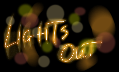 |
| Original glowing text effect experimentation |
