 |
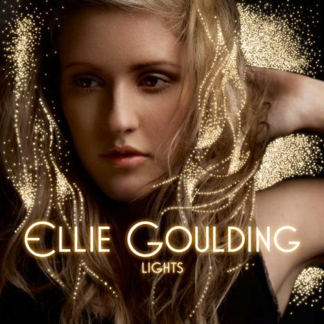
| I like the simplistic nature of this CD cover layout and design. I wish to imply this simple layout into my work as I feel a simple layout attracts the attention of people more than a clusters un-organised layout. |
I am going to place my artist (Poppy) slightly on the left largely and clearly on the front cover of my digipak. This will give me room on the right side of the digipak just like in Ellie Goulding's CD cover for me to add effects or other forms of edit. Also, instead of placing the artist's and album's name in the centre, I wish to bring more focus on the image to the artist herself. This is why I plan to place the album and artist name in the top right corner of my digipak so it does not obstruct the artist's face. Below is a quick draft of what I initially plan the layout of my digipak to look like. The relevant colour scheme of black, red and a white glow is what I am aiming for in terms of design and colour scheme. The layout of the artist on the left and the album and artist title on the right I feel looks well organised and easy on the eye.
 |
| Quick draft of how I would like the front of my digipak to look. The layout is simple and clear along with the artist's name roughly typed to show where it is going to go. There is purposely room on the right hand side so I can add effects or other forms of edit. |
What I aim for in my design is for it to be elegantly thought out and relevant links to the genre, colours, fonts and the music/music video itself. In terms of the back of the digipak, I aim for it to be simple, yet contain all the necessary information every digipak back cover contains. This is all the legal and copyright information along with the necessary music company logos, barcode and disc information.
 Although this image is a bad example of what I want my digipak back cover to look like, I like the way the track list is placed on one side while the artist is placed on the other side. I plan to take this idea further by including all the regular information found on normal CD back covers such as the barcode, music company logos and copyright/legal info. Except for the two things I like about this back cover, this image is a great example of how I don't want my back cover to look like. The edit looks severely unorganised and very unprofessional. My digipak back cover will contain a consistent font from the front cover and will also contain effects fading my artist Poppy into the background.
My advertisement will contain the same font, colour scheme and design as my digipak but with a slightly different layout. This is to ensure I have room to add much more text and logos on the advertisement than I would have needed to add on to the digipak. The advertisement will contain an image of the front cover of my designed digipak. As the digipak front cover will be a block square image, the layout of the advertisement will have to accommodate this so I will have to make sure the artists face on the advertisement is not obstructed by the digipak or the various text I will be adding. Some fonts will vary slightly as a consistent font on the whole entire advertisement will make it look boring. Fonts and font sizes will be altered to attract peoples attention and make the advertisement look more eye catching. I will use a range of effects and features Photoshop can offer to make the my advertisement look as professional and realistic as possible.
No comments:
Post a Comment