 |
| In the summer lessons, we had an introductory look at editing lip-synced music videos and creating digipaks. Pictured are some real-life examples of digipak albums that I own. |
 |
| The key tool needed for successful editing |
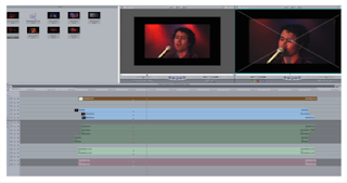
In Jo's lesson, we got ourselves into groups and were given a song that we were to lip-sync to, film, and edit ourselves. This was a step up as we had to acquire our own footage instead of using what we had available to us. We had difficulties as no one wanted to lip-sync to the song, so we had to change it. Eventually we began filming and quickly realized that it was hard to film continuously for the whole song, especially due to the time we wasted to begin with. The track was also hard to hear through the MP3 speaker, and we were only able to rewind all the way to the beginning of the song. When editing, we did not use base tracks, as we didn't have sufficient footage. I was also not in charge of editing, so our practice video was edited in a more 'traditional' way (i.e. without adding the markers, etc.) However, I was quite pleased with the outcome (which you can view below), as we were able to use the footage we did have pretty successfully (we did however have to cut the song down to two minutes).
Next, Marisa gave us a basic tutorial on how to use Photoshop Elements 4.0. This again was easy to grasp as I've used Photoshop CS3 quite extensively in the past, and thus was able to transfer those skills to this similar software. What she did teach us, however, was to (whilst using a 'digipak template'): change the background colour using the Paint Bucket Tool, add and modify the font/colour of text (Horizontal Type Tool), and to add images via either the Marquee Tools or Magic Wand Tool. We again sourced images that were ready for us to use (including a selection to use for the cover, as well as additional album-related graphics such as barcodes and record label logos).
 |
| My completed preliminary digipak design |
I chose to use the light-bulb image for the front cover purely for aesthetic reasons. I added the image by using the Magic Wand Tool to select the areas around the bulb (whilst holding the shift key to add to selection). This then allowed me to delete the background. Next, I sourced another light bulb image from the internet, resized it to the same size as the original by going to Image > Transform > Free Transform, then layered it on top of the existing image by changing the opacity to 20%. Furthermore, I used the Custom Shape Tool to create the red explosive shapes in the background, again playing with the opacity of the layers. I created the text by duplicating the text layer and changing the colour/size to give an outline effect. I also added an eye-catching sticker using the Rounded Rectangle Tool, and added text on top (I also slightly rotated it to give a more realistic effect).
 |
| The original image I used for the back cover |
Strengths of digipak:
- Consistent colour scheme
- Shows artist name prominently
- Features barcode, record label logo and copyright info which you would find on a typical digipak
- Sticker gives a realistic touch
Weaknesses:
- No album title?
- Texture on the back cover does not blend with the black on the right and where it meets the barcode + label logo, which gives an unprofessional feel
- No image of artist shown; this is important in order to allow for recognition (however, this imagery commonly does not appear on artwork for non-vocal music, e.g. techno, so genre must be taken into consideration)
 |
| My practice digipak vs Real examples |


