Overall I was very proud of the main product we produced, and I think that the music video was very successful, as well as fun filming. In creating my Digipak, although I did go through some difficulties, I finally produced work that I am happy with and I tried hard to continuously link both products. Here is a PREZI I have created explaining some of the ways in which I linked both products together as well as creating them with the wants of my target audience in mind.
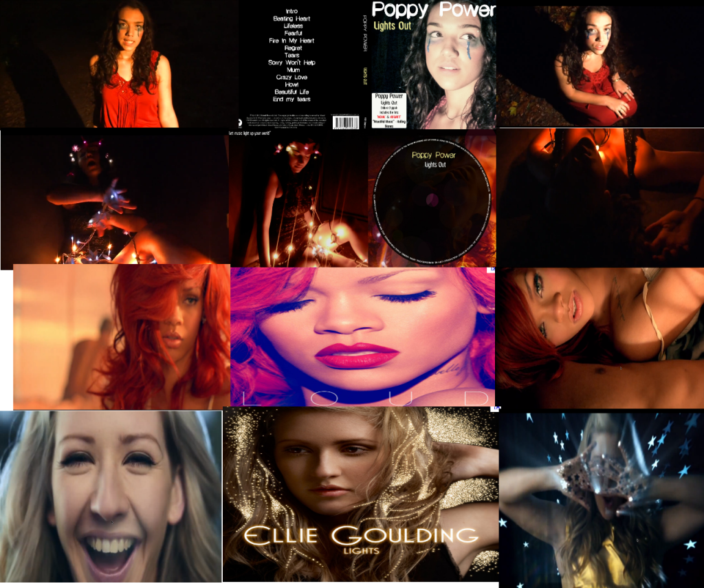
Below is a collage I have made which is a few images of the pictures I have taken from my music video and used on my Digipak. There are also examples of other artists who have done the same thing - their image has been represented similarly or maintained the same to link the ancillary products to the music video and make it clear to the audience who the artist is and make it clear which song where the video has been released, will be featured on the album.

Rihanna has maintained the same image, as she is pictured in her music video California King Bed with curly red hair, and then pictured again on her album cover Loud with the same style. This shows the audience that the video is linked to the album cover, and the song will be featured on it. As with Ellie Goulding, the close up screen shots I have taken from her video Starry Eyed are linked to the image of her on the Album cover, as glittery shot to the right of the album is similar to the artistic shot on the front of her album cover. Her target audience will instantly know that the song is on the album. In my Digipak cover, I made sure that I used shots taken on the set of my video to link both products, because it is a convention of a successful promotional package.
 |
| Ellie Gouldings Album Cover, Advertisement poster and A screen grab from her music video. |
 |
| Florence and the Machines Album cover, advertisement poster and a screen grab taken from her music video |
 |
| Here is Rihannas advertisement poster, album cover and a screen grab from her music video. |
No comments:
Post a Comment