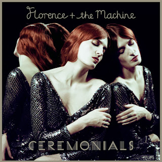
If we then look at her image of her most recent album: CEREMONIALS. It is a lot darker and not presenting the image of natural anymore. With slicked back, hair. Clear, white skin and black sparkling clothes. She has changed her persona to suit the style of pop culture, leaving her Alternative 'look' in the past. With a hint of disappointment on her choice of makeover, her songs have not yet disappointed me as she still grasps onto the natural beauty of story telling in her lyrics with every song.
In her website, it shows her new 'look' promoting her album by changing her website completely. With the first page promoting her new tour in 2012.

With every page, promoting her new album with music videos and images. This website is much more calmer and plain than the website from 2010. They are using every chance they get on their website to promote her album, with song testers that play as you look around her website, her personal blog that you can follow which she personally uploads regular blogs about where she is with fun comments and pictures. With such a different image, all of her music videos are portraying her new found look with beauty shots and less movement and less crazy dancing and more on Florence herself and not just as a entertainer but as an artist with her concentrating more on her singing by staying still in her music videos.


No comments:
Post a Comment