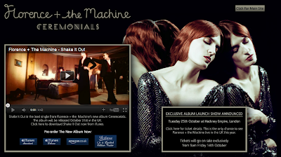
As soon as we access the site, we are taken to a landing page designed to promote Florence and the Machine's upcoming album, Ceremonials. As a fan of this artist, I am quite familiar with the website, and so when I visited the site today I instantly noticed that the design had changed. The embedded video of her new single (Shake It Out), the dark background coupled with an image of Florence Welch taking up half of the page, and the title showing the album name all tell me that Florence has a new album coming out, and so the website has been redesigned to reflect a new era for her music.
 |
| Landing page |
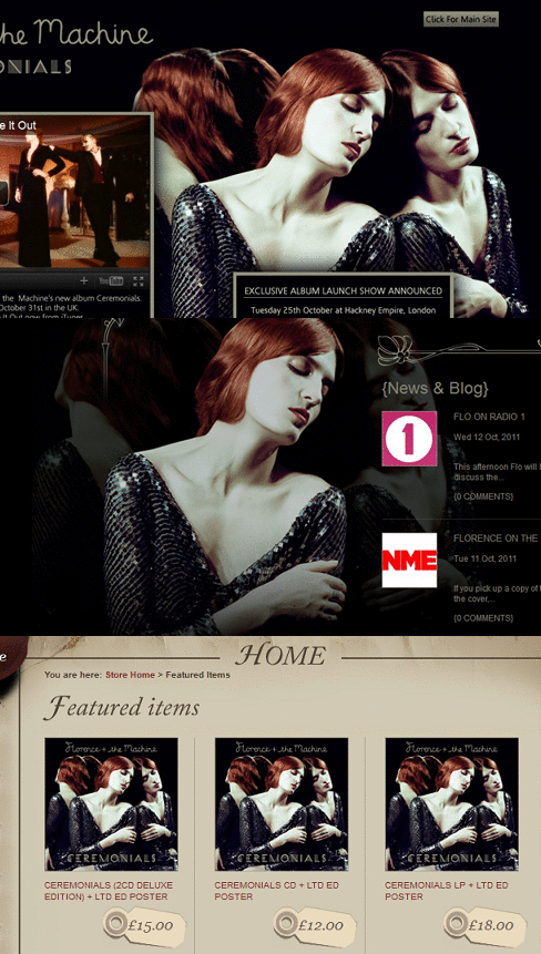
The aforementioned elements of this landing page are all important. The large image of Florence has been designed to give the visitor a face behind the music. An image from a recent photo shoot has been used (i.e. not an old image used to promote her debut album, Lungs) which is significant as returning fans wouldn't want to see the same old photos. The new image portrays Welch in a relatively new style to represent the new album and that it is a development from her previous release. This is clear as the artwork for her upcoming album uses this same image. This repetition isn't a coincidence - it's so that the public are able to recognise Florence, whether it's seeing her CD on a shelf in a music store (or the cover art in a digital music store such as iTunes) or advertising such as billboards, flyers, etc.
 |
| Repetition of artist imagery |
Another important aspect is the embedded music video for her new single. This acts as a starting point for visitors that aren't necessarily fans to get a taste of her music. The fact that this is the lead single of her upcoming album is important as it has been chosen specifically to promote the new record. The music video backs it up, and by viewing it you can tell that it fits in with the overall dark yet classy theme of the site. Below the music video, there are four different links that enable you to pre-order Ceremonials - two from iTunes (standard and deluxe editions), one from Amazon and the other from the 'Flotique' (i.e. Florence' online store), the latter of which advertises the fact that a limited edition poster is available alongside the physical CD. This is to entice the purchaser into ordering a slightly more expensive copy straight from the site, and rewarding them with a 'limited edition' bonus.
Finally, an announcement stating that an 'exclusive album launch show' (in capital letters) will take place soon, for which tickets will be available, is also shown. This one-off gig ("the only chance to see Florence in the UK this year") again acts as promotion for the new album.
 |
| Homepage |
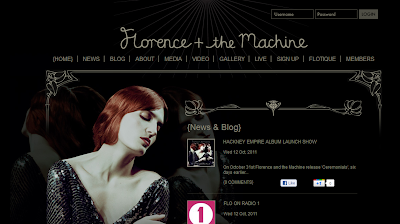
Once we navigate to the main site, we are greeted with the previous image of
Florence again (more repetition), the latest
 |
| "What the Water Gave Me" |
Several links are present on the homepage, including separate pages for the latest news concerning Florence and the Machine and blog posts from Welch. There is also an 'about' page, detailing Florence as a performer and artist, her music, and everything in between. A 'media' page is present, which contains information regarding Florence's music releases and where they are available for purchase. Video and gallery pages serve as visual entertainment for the visitors, whilst the link labelled as 'live' leads to a list of upcoming gigs that fans can buy tickets for. In addition, a forum is available which encourages fans to actively engage with other fans, forming a community around the discussion of all things Florence.
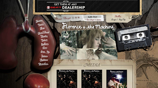
The website hierarchy, so-to-speak, has been thought out very carefully. The opening page is specifically designed to promote the artist's latest album, single, and gig, whilst the homepage is a bit more general yet still concentrating on the new album. The links then acts as a gateway for older releases, information, etc, with these pages keeping the 'old' theme that represents the Lungs (debut album) era.
 |
| A yet-to-be redesigned section of the website |
It is fair to say that this site uses multimedia very well, with the media players alone serving as engaging features. On every link from the homepage there is a music player that auto-plays music from Florence's first album. On the landing and home page there are songs from her new album in the form of music videos. Thus, you can play the artist's tracks from virtually every page of the website, which is really clever as it is exposing the visitor to their music as much as possible during their visit.
On the video page, an embedded player is present that allows the visitor to also view all of Florence's music videos, in addition to footage of live performances, "in the studio" features, and short films narrated by Welch herself. Whilst Florence and the Machine are technically a band, it is clear that emphasis is placed on Florence as the performer and image of the band. It is also evident that their website is a successful one that acts as a hub of latest information and media, which is bound to keep new fans exploring for more than just a couple of minutes.


No comments:
Post a Comment