Saturday, 17 December 2011

Planning of Ancillary Work - Fonts

Here is a list of some of the fonts I have been browsing. I used a website called 'Da Font' whereby I am able to download fonts and import them into photoshop. There is also a programme on Photoshop that lets you choose from a variety of fonts the programme. Below are the ones that have caught my attention. I particularly like the top font 'I Still Know' found on the Photoshop font programme, as well as the final font 'Decibel' which I found on Da Font.
I think I am most likely going to go with 'Decibel' for my final Digipak cover, however I have tried out the other fonts on my template just to see how they look. I think the font is still clear to read, and I like the shakey effect it has on it. I also like the fact that it is Sans Serif, I think this style of font represents the artist more as it represents her different, alternative style of music.


Planning Ancillary Work - Editing Images

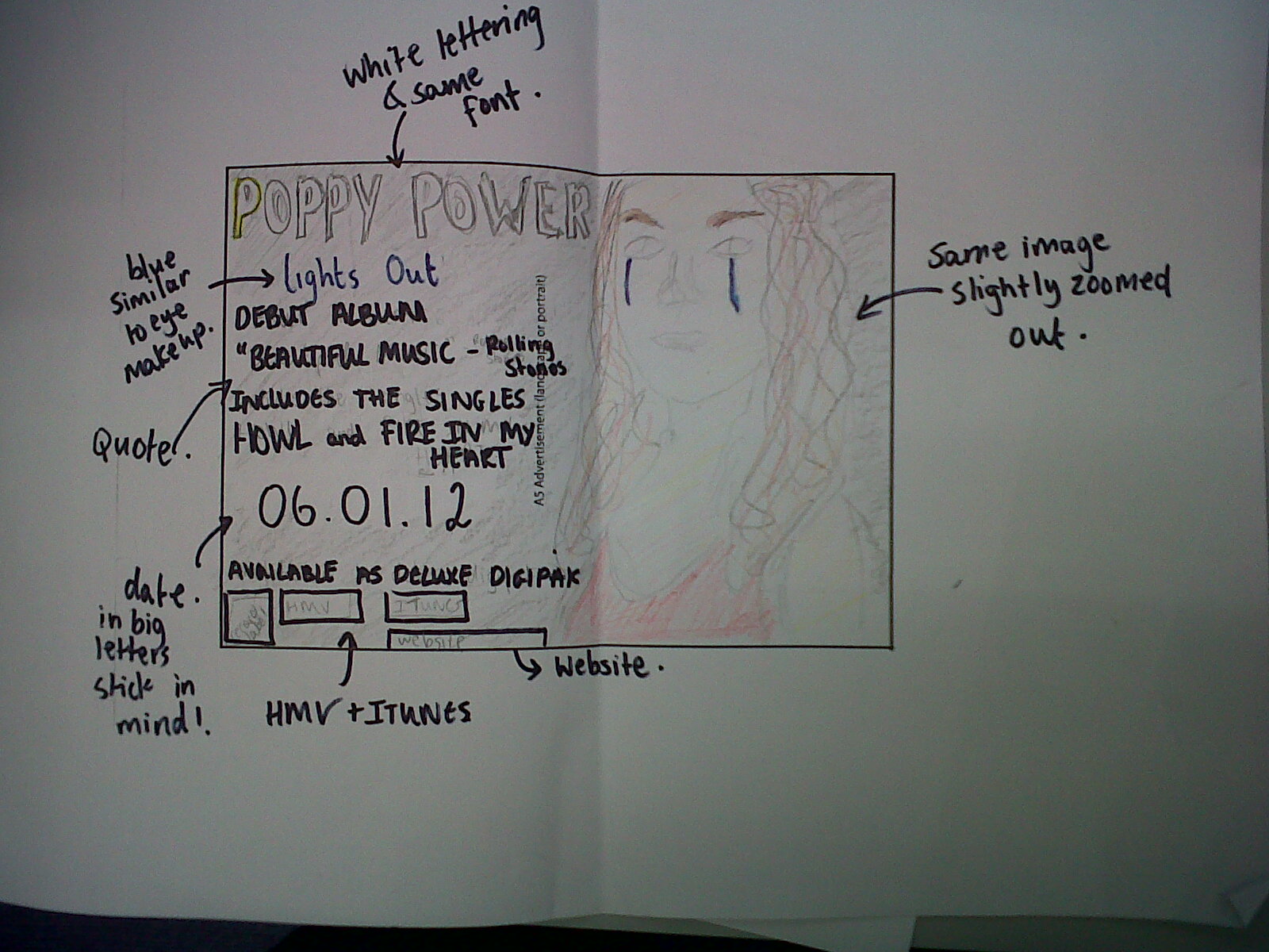
 The image to the left is the edited version of the original image (right) that I will be using for my front cover. I will zoom in closer to this image because I think the facial expression will appeal straight to the audience, and the close up will work better on the front cover. This style of make up and costume resemble the video and automatically links them. It also represents the alternative 'artistic' feel to the artist.


I also edited this image using iPhoto to create a different effect. I felt the other one was two yellowy and rich in colour, so I sharpened the image so more detail in the background is obvious. I also changed the colour tone, but using the fade tool. This makes the image look duller in colour, as I think it works a lot better in representing my artist,


Friday, 16 December 2011

Planning - Do's and Don'ts

Before beginning work on our ancillary products, we went over some advice in class of what to do and not do when producing these pieces of work. This was handily given to us in the form of a handout and our teacher demonstrated these suggestions in Photoshop for us.

First of all, and one of the most important things to consider, is the font choices. We must make sure that they are clear and easy to read, as the consumer must be able to easily recognise the artist and album names, often from a distance. In addition, these must be of an appropriate size, which also applies for the images used. To help us to identify these conventions, we've been looking at existing albums. From this, we have observed that the artist name is commonly larger than that of the album name, and so I'll be adapting this for my own album. The font should additionally be appropriate in fitting with the overall house style (i.e. it should be consistent from panel to panel) and the artist's genre conventions, and should be carefully placed accordingly.

Photos used must be in focus and if they are the wrong size then the dimensions shouldn't be disproportionally stretched or constrained to fit the template. This is because this is never done in real examples and it ultimately gives off a really amateurish look. Colours should be chosen carefully. Usually, albums use no more than about three main colours which are appropriate for the text, images and background. The colours used should also ideally complement each other and be easy on the eye. Effects such as filters, whether on text or image, should be used scarcely, and only if suitable for the genre.

Keeping all of this in mind, I created the following example of how not to create an album cover...

Tuesday, 13 December 2011

Production - Beginning to Produce Digipak

Now that I have produced a mock-up, of which my teacher approves of, I have begun working on the actual product. I have been using both Photoshop Elements and Photoshop CS3, as I have the latter at home (which I'm much more accustomed to using). Below you can see a video I filmed showing my progress over the weekend.


Following this, we had our last lesson before the Christmas break today. Because of this, it is crucial that I continue working on my ancillary products over the next couple of weeks, especially since we will be missing a couple of lessons. Nonetheless, below you can see what I have worked on today and how the front and back of my slipcase look like.

Digipak Mock Up