Tuesday, 3 January 2012

Ancillary products

In class, we discussed the importance of Digipacks and their functions in the music industry. A digipack is a modern approach to the CD's packaging. It has only been in the industry for the past decade. It is made from thick cardboard to make it sturdy and hard to damage, it contains a lot more information about the artist, giving the customer who has payed extra for the digipack some extras that you don't get when you purchase online or just a normal CD case. This 'adds value' to the digipack which is why it is always more expensive than the plain cd pack. The digipack is aimed to interest the big fans of the music artist. 
Even though there has been a large decline in the sales of digipaks, this is more likely because the digipacks are only aimed for the true and big fans. 

The best part about digipacks are that they help combat piracy as they cannot be copied or dowloaded online as you can't recieve the extra features that the digipacks provide. This is what encourages fans to buy the digipacks which is therefore supporting the artist and helping the music industry in the long run. Ancillary products are very important to the artists and the industry as they are a crucial amount of profit. Audiences rely on advertisement that surrounds us on buses, billboards and on our televisions, we have relied so much on it now, that there is no other way we would hear about the artists and newest songs or acts without it.

Some of us mentioned how the digipack could be seen as an expression of art and a representation of what the audience should expect of the artist. Ultimately, as the fans of the music and the art of the digipacks, the combination of both would bring in a lot of customers from the large fan basses of the artist as well as people who have not heard of them before, if they see the cover and like the style, they may be interested to buy it. And so, it is very important to draw in the audience with an attractive and eye catching digipack. 

Digipacks are also a very good way of changing an artists image and even their music. As the picture on the front, represents the style of music that will be played in the cd. It is a way that the artist can change their look, yet keep their style of music or change their image completely just from the the digipack. Here are a few album covers that express artists in different ways. 


Thursday, 29 December 2011

Production - Progress of Digipak's Inside Panels

Step-by-step animation showing the progress of my digipak's inside panels
...
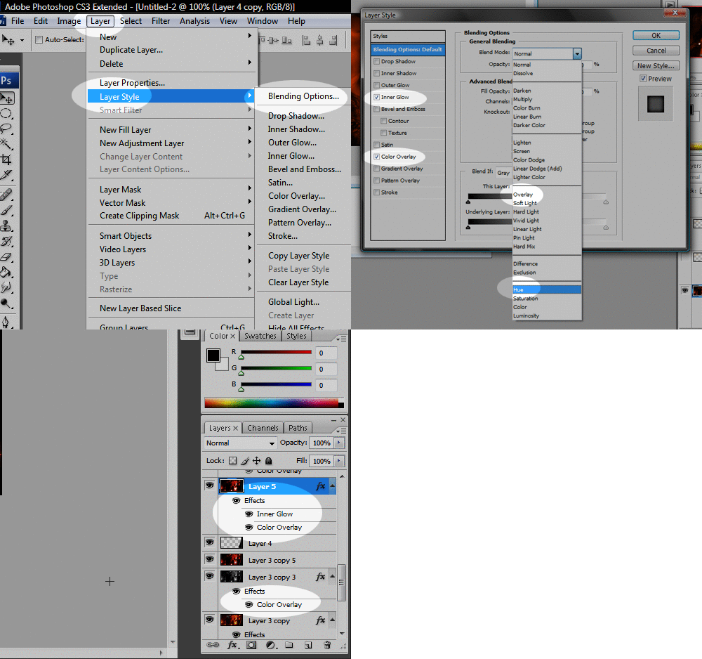
In order to achieve the above outcome, I knew right away that the photo I planned to use across both inside panels had to be edited. First of all, I added a black and white filter on the photo, before putting an additional reddish-orange colour overlay (in Photoshop CS3: Layer > Layer Style > Blending Options > Color Overlay > Blend Mode: Overlay), creating a nice contrasting effect. Because the shadows were now emphasized, I was able to easily edit out the tripod leg on the right using the Brush Tool. I subsequently also noticed that there was another out-of-place object, this time on the floor to the left. After a few unsuccessful attempts at using the Brush Tool again to edit it out, I experimented with the Clone Stamp Tool instead which allowed me to 'sample' a patch of the carpet texture (alt + left click). Then, using the stamp I covered up the object which in turn replicated the texture. I made sure to blend it in as much as possible, resulting in a pretty convincing edit! I then added yet another colour overlay over the whole image, this time opting for the Blend Mode: Hue setting, which lightened the colour slightly. I also used the Inner Glow effect under the Blending Options menu in order to add a faded black border as a finishing touch.

Adding layer effects in Photoshop CS3
...
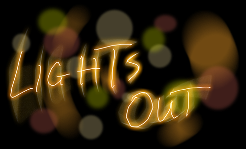
Afterwards, I started exploring online Photoshop tutorials in the hopes of stumbling across something that could enhance my design. In the end, I found this glowing text tutorial, which I loosely followed in order to create the 'Lights Out' typography you can see in the final steps above. Whilst creating it, I hoped to give a "light graffiti" effect, as seen in Imogen Heap's album booklet (and featured in this slideshow). At the moment, however, I am undecided whether I will keep it, as I'm not sure if it fits in with the overall design, but it's definitely something I will consider.

Original glowing text effect experimentation

Tuesday, 27 December 2011

Research - Album Stickers

A common feature for albums, which I have decided to replicate for my digipak, is the presence of a promotional sticker that is affixed to the front cover. The sticker serves as an additional way to entice the consumer into purchasing the album, by highlighting the inclusion of singles that the audience may be familiar with, special edition features, etc. I have therefore decided to take a look at various examples of these stickers, which you can see for yourself below, and identify the information that is most commonly displayed on them.

Hover over to expand:

  • Singles that are included (e.g. "Includes the #1 single...")
  • Bonus content - extra tracks, bonus disc, making of's, etc.
  • Excerpts from favourable reviews (e.g. "The voice of 2011 - Q Magazine") and/or amount of 'stars'.
  • If the album is a limited or special edition version, then it is clearly labeled as such.
  • Album and/or artist name may be repeated for emphasis
  • Barcode number (in small characters - also present on the album's spine)

Saturday, 17 December 2011

Planning - Ancillary Product Ideas

Production of Ancillary Product

I spent some time on Photoshop on Friday slightly putting the start of my Digipak together. Below is the original cover I started with, however I didn't like the shade of the images so I edited them and tried again.


Here I have added the 'I Still Know' font, just to see how it looks. I also added the title of the album beneath, with a font I found on Da Font. I am still unsure about the fonts but am trying them out regardless. However I like the effect of the pictures this time and think it makes the album cover stand out.