Thursday, 13 October 2011

Planning - Audience Profile

We have created a profile for an example of a member from our music video's target audience. Above you can see a college comprising of their lifestyle, hobbies, and interests. Below, you can see a more detailed description of our audience member.

  • Name: Hannah Welch
  • Age: 20
  • Ethnicity: English with Italian heritage
  • Is studying Fine Art at Greenwich University, resides on Avery Campus in London
  • Occupation: works at a bar part-time
  • Shops at Sainsbury’s and Iceland
  • Travels by train and shuttle bus
  • Reads the Evening Standard and Vogue Magazine
  • Gadgets she owns include iPhone, iPad and Kindle e-reader
  • Hobbies include painting, photography and writing poetry
  • Favourite brand: Converse
  • Shops for clothes at Topshop
  • Favourite beverages: Pimm's and Starbucks Vanilla Latte
  • Would love to go on holiday to Thailand and Tokyo
  • The genre of music that our artist falls under appeals to Hannah as she feels she can relate to our artist's positive portrayal of women and enjoys music that has meaningful lyrics
  • Hannah can be classed as a succeeder as her parents have a substantial amount of money, but she has no desire for status symbols. She is independent and knows what she wants to do with her life.

Planning - Animatic


Above you can see the animatic we produced, consisting of a mixture of our storyboard sketches done by Poppy and photographs taken with a toy figure. We tried to reflect the kind of cuts we would use for our music video by keeping the shots in time with the track, and used images from our chosen locations in the background.

Wednesday, 12 October 2011

Planning - Original Artist's Website

Today I will be looking at the artist of our chosen song's website, which you can see here.

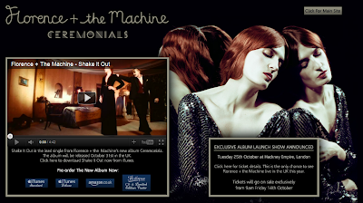
As soon as we access the site, we are taken to a landing page designed to promote Florence and the Machine's upcoming album, Ceremonials. As a fan of this artist, I am quite familiar with the website, and so when I visited the site today I instantly noticed that the design had changed. The embedded video of her new single (Shake It Out), the dark background coupled with an image of Florence Welch taking up half of the page, and the title showing the album name all tell me that Florence has a new album coming out, and so the website has been redesigned to reflect a new era for her music.
Landing page

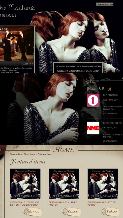
The aforementioned elements of this landing page are all important. The large image of Florence has been designed to give the visitor a face behind the music. An image from a recent photo shoot has been used (i.e. not an old image used to promote her debut album, Lungs) which is significant as returning fans wouldn't want to see the same old photos. The new image portrays Welch in a relatively new style to represent the new album and that it is a development from her previous release. This is clear as the artwork for her upcoming album uses this same image. This repetition isn't a coincidence - it's so that the public are able to recognise Florence, whether it's seeing her CD on a shelf in a music store (or the cover art in a digital music store such as iTunes) or advertising such as billboards, flyers, etc.
Repetition of artist imagery

Another important aspect is the embedded music video for her new single. This acts as a starting point for visitors that aren't necessarily fans to get a taste of her music. The fact that this is the lead single of her upcoming album is important as it has been chosen specifically to promote the new record. The music video backs it up, and by viewing it you can tell that it fits in with the overall dark yet classy theme of the site. Below the music video, there are four different links that enable you to pre-order Ceremonials - two from iTunes (standard and deluxe editions), one from Amazon and the other from the 'Flotique' (i.e. Florence' online store), the latter of which advertises the fact that a limited edition poster is available alongside the physical CD. This is to entice the purchaser into ordering a slightly more expensive copy straight from the site, and rewarding them with a 'limited edition' bonus.

Finally, an announcement stating that an 'exclusive album launch show' (in capital letters) will take place soon, for which tickets will be available, is also shown. This one-off  gig ("the only chance to see Florence in the UK this year") again acts as promotion for the new album.
Homepage

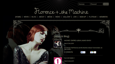
Once we navigate to the main site, we are greeted with the previous image of
Florence again (more repetition), the latest
"What the Water Gave Me"
news and blog posts regarding the artist, and another embedded music video at the bottom of the page. The latter is interesting as it is set to auto-play as soon as you load the site. The song in question is What the Water Gave Me, which is a promo single from the new album. Also on the page is a Twitter feed from Forence herself, which is significant as use of social media has pretty much become a requirement of musicians in this day and age. This allows artists to easily communicate with fans, and is a great promotional tool.
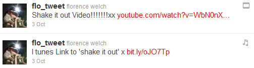
A couple of Welch's latest messages to fans, illustrating the marketing potential of social media. These 'tweets', which respectively invites fans to watch her new music video and buy the single from iTunes, appeared in over 80,000 people's Twitter feeds (at time of writing, she has 86,109 'followers').

Underneath the Twitter feed is a 'Featured Items' section promoting Florence's official merchandise - artists are increasingly relying on selling products besides music (along with tickets to see the artist live) to earn revenue due to the rise of music piracy.

Several links are present on the homepage, including separate pages for the latest news concerning Florence and the Machine and blog posts from Welch. There is also an 'about' page, detailing Florence as a performer and artist, her music, and everything in between. A 'media' page is present, which contains information regarding Florence's music releases and where they are available for purchase. Video and gallery pages serve as visual entertainment for the visitors, whilst the link labelled as 'live' leads to a list of upcoming gigs that fans can buy tickets for. In addition, a forum is available which encourages fans to actively engage with other fans, forming a community around the discussion of all things Florence.

The website hierarchy, so-to-speak, has been thought out very carefully. The opening page is specifically designed to promote the artist's latest album, single, and gig, whilst the homepage is a bit more general yet still concentrating on the new album. The links then acts as a gateway for older releases, information, etc, with these pages keeping the 'old' theme that represents the Lungs (debut album) era.
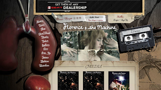
A yet-to-be redesigned section of the website

It is fair to say that this site uses multimedia very well, with the media players alone serving as engaging features. On every link from the homepage there is a music player that auto-plays music from Florence's first album. On the landing and home page there are songs from her new album in the form of music videos. Thus, you can play the artist's tracks from virtually every page of the website, which is really clever as it is exposing the visitor to their music as much as possible during their visit.

On the video page, an embedded player is present that allows the visitor to also view all of Florence's music videos, in addition to footage of live performances, "in the studio" features, and short films narrated by Welch herself. Whilst Florence and the Machine are technically a band, it is clear that emphasis is placed on Florence as the performer and image of the band. It is also evident that their website is a successful one that acts as a hub of latest information and media, which is bound to keep new fans exploring for more than just a couple of minutes.

Tuesday, 11 October 2011

PLANNING: Artist's Website Analysis

Front Page of the website.

Here is the front page of the website for the artist Florence and the Machine. Straight away the audience is presented with a huge image of the artist against a black background. The image of the artist is deliberately shown to promote herself to whoever visits the webpage. I initially didn't really know what the artist actually looked like until I visited the website itself. Now, after seeing the front page, I know exactly who Florence and the Machine is and what they look like, and this is what their aim is. The huge image of the artist on the front page of the website is there to basically show who she is and who Florence and the Machine is. Against the black background, the artist really stands out with the reflection of her showing both sides of her face as well as the back of her head. This is so we can see what she looks like from every angle. Its a very cleverly thought out image to present/promote the brand, of which it is artist them self. 

To the left of the front page, there is a music video of her latest song, Shake it Out. The main reason this is shown there is to yet again promote the music video as it is one of the first things people will see when they first visit the site. The main reason it is there is so her latest content is shown directly to the audience, thus advertising her music and herself. To the top right of the front page, there is a little button which says "Click for Main Site". This tells me that the objective of the front page is to just promote the artist and her music to the audience, and do nothing more. This is because if you want to find out more, then you can visit the homepage of the website where there will be much more info.

Home Page of the website.
Moving on to the main page of the website and straight away we can see there is a menu of links to navigate around the site. This was not evident on the front page of the website as its soul purpose was to just promote the artist and her latest music, which is why there was an option to continue to the full site if you wanted to know more. The fact that there are links such as Media, Video, Gallery and Live show that the artist is trying to give their fans as much content of them as possible with various ways of accessing it. Yet again on the homepage we can see a large image of the artist so we know who she is and what she looks like as an audience. We can also see News and Blog section which is trying to show the audience the latest information about the artist. This can include news telling the audience about her latest album releases or tours she may be going on. This is yet again trying advertise herself and her work.

As soon as you go on the main page of the website, one of the artists music videos automatically begin playing. I personally find this very annoying as, if I want to watch a video, I would go and search for what I want to watch, then view it. However, the reason the music video automatically plays when you go onto the home page is because the artist is trying to share her music with you. By automatically playing, I as the audience am forced to scroll down and pause it. However even doing this is giving the artist attention from me which is what they want, as I will at least see the name of the song playing while I'm pausing the video, thus advertising the artist's music. If I don't do nothing about the video, the music will just play until it is done, which in a way is the artist forcing their music upon me. The fact that the music video is placed at the very bottom of the homepage is very clever, as it allows me to see all the other content they have on that webpage before I get to the video. This is a very good method in which to show her content as much as possible to any person visiting the Florence and the Machine website.

PLANNING: Analysis of Original Music Video

Currently, there is no official music video for the song, Howl by Florence and the Machine. This may be because the song had already seen success in the music charts. A music video's main purpose is to promote the artist as well as the song. Yet, this song was able to get over 2.3 million views on Youtube with just her album cover for people to look at while the song is being played.

I believe that a music video was not created as the artist felt it was unnecessary to create a music video if the song itself has already become a hit. When my group first mentioned to use this song in our music video, I had no idea what the song was. But until I actually heard the track, I instantly recognised what song it was as I had heard it before (even though I didn't know the name of it). Florence and the Machine is not an artist I personally listen to, however, the fact that I had heard this song multiple times before even though I do not listen to the artist's music at all shows how mainstream this song is.

However, a music video may not have been created for this song as the artist may of thought there is nothing extra they can show on screen that the artist hasn't made the audience visualise in their heads while listening to this song. The fact that you can listen to the song with such powerful lyrics alone shows that a music video may not capture the concept they were trying to perceive, as everyone can relate to the emotions the artist is trying to convey in the lyrics.